Supply and Demand Curves Generator
Free online Supply and Demand Curves generator: get a fully labeled figure in about 90 seconds. The AI plans the must-have label list first, then renders a clean textbook-style diagram — every label editable afterwards, ready for papers, assignments and slides.
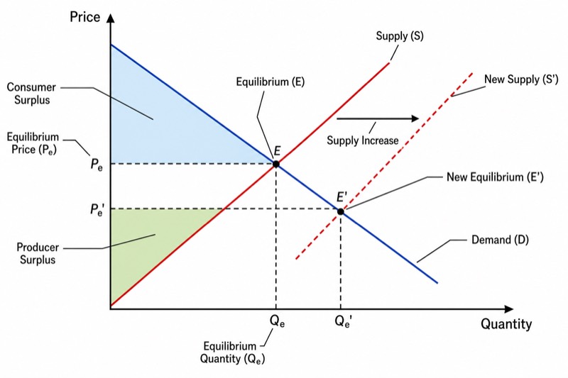
Labels included in this diagram
- Price
- Quantity
- Demand (D)
- Supply (S)
- Equilibrium (E)
- Equilibrium Price (P_e)
- Equilibrium Quantity (Q_e)
- Consumer Surplus
- Producer Surplus
- New Supply (S')
- Supply Increase
- New Equilibrium (E')
✓ Accurate labels ✓ Edit text after generation ✓ PNG for papers, posters & slides
 OUTPUT · 16:9 · PNG
What this diagram shows
A supply and demand graph models how a competitive market determines price and quantity. Quantity is measured on the horizontal axis and price on the vertical axis. The downward-sloping demand curve, D, represents consumers’ willingness to pay for successive units, while the upward-sloping supply curve, S, represents firms’ marginal cost of producing them. Their intersection is equilibrium point E, which identifies the equilibrium price and equilibrium quantity. At this allocation, quantity demanded equals quantity supplied, so there is no persistent tendency for price to change.
Consumer surplus is the area below the demand curve and above the market price, up to the equilibrium quantity. Producer surplus is the area above the supply curve and below the market price over the same quantity range. If supply increases, the entire supply curve shifts rightward because sellers offer more at every possible price. The new intersection with D establishes a lower equilibrium price and a higher equilibrium quantity, assuming demand is unchanged. This comparative-static result differs from movement along a fixed supply curve, which occurs when the good’s own price changes.
What a correct diagram must include
- Axes and variables: place quantity on the horizontal axis and price on the vertical axis, and label both clearly.
- Demand curve D: draw it downward sloping to represent the inverse relationship between price and quantity demanded, other factors held constant.
- Supply curve S: draw it upward sloping to represent the positive relationship between price and quantity supplied, other factors held constant.
- Equilibrium point E: mark the intersection of D and S, where quantity demanded equals quantity supplied.
- Equilibrium price and quantity: project dashed lines from E to the price and quantity axes so both equilibrium values can be read precisely.
- Surplus regions: shade consumer surplus above the equilibrium price and below D, and producer surplus below the equilibrium price and above S.
- Rightward supply shift: add a new curve, such as S2, to the right of S and distinguish it from movement along the original curve.
- New equilibrium: mark the intersection of D and S2 and show the resulting lower equilibrium price and higher equilibrium quantity.
Common mistakes
- Reversing the axes by placing price horizontally and quantity vertically, contrary to the standard introductory economics convention.
- Drawing demand upward sloping or supply downward sloping without identifying a special theoretical case.
- Treating an increase in supply as movement along S rather than shifting the entire supply curve to the right.
- Shading consumer or producer surplus beyond the quantity traded, or using the wrong boundaries for either area.
- Showing the new equilibrium after a rightward supply shift with both a higher price and a higher quantity while holding demand constant.
Teaching tips
Use the graph after introducing demand, supply, and market equilibrium, then revisit it during comparative statics and welfare analysis. Ask students to identify the condition represented by E, predict adjustment when price is above or below equilibrium, and explain why a rightward supply shift lowers price but raises quantity. Have them shade consumer and producer surplus before and after the shift. The diagram supports assessment of curve shifts versus movements along curves, equilibrium calculation, shortage and surplus adjustment, and changes in market welfare.
FAQ about this diagram
Why does the demand curve slope downward while the supply curve slopes upward?
A lower price generally increases quantity demanded because additional units become worthwhile to consumers. A higher price generally increases quantity supplied because firms can cover the rising marginal cost of producing additional units.
What is the difference between a supply shift and movement along the supply curve?
Movement along a supply curve is caused by a change in the good’s own price. A shift of the curve is caused by a non-price determinant, such as input costs, technology, taxes, expectations, or the number of sellers.
How are consumer surplus and producer surplus identified on the graph?
Consumer surplus lies below D and above the market price for units traded. Producer surplus lies above S and below the market price; together, they form total surplus when no additional external costs or benefits are present.