Scientific Poster Layout Generator
Free online Scientific Poster Layout generator: get a fully labeled figure in about 90 seconds. The AI plans the must-have label list first, then renders a clean textbook-style diagram — every label editable afterwards, ready for papers, assignments and slides.
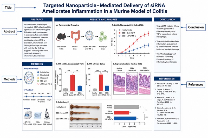
Labels included in this diagram
- Title
- Abstract
- Methods
- Results and Figures
- Conclusion
- References
✓ Accurate labels ✓ Edit text after generation ✓ PNG for papers, posters & slides
 OUTPUT · 16:9 · PNG
What this diagram shows
A biomedical Scientific Poster Layout organizes a complete research narrative into clearly labeled visual zones. The Title identifies the study, authors, and affiliations, while the Abstract summarizes the research question, approach, principal findings, and significance. Methods explain the study design, participants or specimens, interventions, measurements, and statistical analysis. Results and Figures present the primary evidence through graphs, tables, images, and concise interpretive text. The Conclusion states the main inference, limitations, and implications. References document essential sources and support research integrity. Together, these sections allow readers to assess scientific validity rapidly while choosing where to examine the study in greater depth.
The layout should follow the logic of scientific inquiry rather than function as a collection of independent boxes. Readers usually move from the Title and Abstract to the Methods, then to Results and Figures, and finally to the Conclusion and References. Visual hierarchy establishes this sequence through column order, headings, alignment, spacing, and consistent typography. Methods must provide enough context to interpret each result, while every major conclusion should be traceable to displayed evidence. Figures should therefore occupy the largest area and appear near the methods or claims they support. References remain visually secondary but must be readable and connected to in-text citations.
What a correct diagram must include
- Title area — Place a concise, specific title at the top with authors and affiliations, using the largest type so the research topic is identifiable from a distance.
- Abstract — Summarize the background, objective, methods, key result, and significance in a compact block without duplicating every detail from later sections.
- Methods — Show the study design, sample, experimental workflow, variables, controls, and statistical procedures, preferably with a schematic or flow diagram.
- Results and Figures — Allocate the greatest proportion of space to labeled graphs, tables, microscopy images, or clinical data, each with units, legends, and a clear takeaway.
- Conclusion — State only conclusions supported by the displayed results, then identify major limitations, biomedical relevance, or appropriate next steps.
- References — Include a short, consistently formatted list of the most relevant sources and connect cited claims to numbered or author-date citations.
- Reading path and visual hierarchy — Arrange sections in a predictable column sequence and use consistent headings, alignment, color, and whitespace to guide readers.
- Scientific accessibility — Ensure readable font sizes, sufficient color contrast, defined abbreviations, and figure designs that remain interpretable without oral explanation.
Common mistakes
- Giving every section equal space, which reduces the area available for Results and Figures even though evidence should dominate a scientific poster.
- Placing the Conclusion before the supporting results or separating claims from their corresponding figures, thereby breaking the research narrative.
- Using an Abstract as a full introduction or repeating identical text across sections instead of assigning each section a distinct scientific function.
- Displaying figures without axis labels, units, sample sizes, uncertainty measures, statistical annotations, or captions that explain the main comparison.
- Making causal claims from observational or correlational data, or presenting conclusions that are broader than the study population and methods justify.
Teaching tips
Use the diagram after students have learned the structure of a biomedical research article and before they design their own posters. Ask them to trace the reading path, identify which section answers each research question, and match every conclusion to a specific result. Students can critique a deliberately flawed layout by reallocating space, moving figures, and restoring missing labels or methodological links. Assessment can test visual hierarchy, correspondence between methods and results, figure literacy, accurate interpretation of evidence, and the distinction between a poster's concise communication function and a manuscript's comprehensive reporting function.
FAQ about this diagram
Which section should occupy the most space in a biomedical scientific poster?
Results and Figures should usually occupy the largest area because the poster's primary purpose is to communicate evidence. Methods need enough detail for validity assessment, but procedural text should not displace essential data visualizations.
What is the difference between the Abstract and the Conclusion?
The Abstract summarizes the entire study, including its objective, methods, main findings, and significance. The Conclusion interprets the displayed evidence, states the supported inference, and may note limitations or future directions.
Must a scientific poster follow the same order as a research paper?
It should preserve the underlying logic of question, method, evidence, and inference, but it may use columns, diagrams, and visual grouping rather than a strictly linear format. The intended reading path must remain obvious through headings, alignment, numbering, or directional cues.