Gantt Chart: Research Plan Generator
Free online Gantt Chart: Research Plan generator: get a fully labeled figure in about 90 seconds. The AI plans the must-have label list first, then renders a clean textbook-style diagram — every label editable afterwards, ready for papers, assignments and slides.
Labels included in this diagram
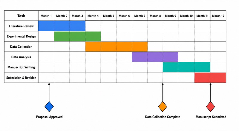
- Literature Review
- Experimental Design
- Data Collection
- Data Analysis
- Manuscript Writing
- Submission & Revision
- Month 1–Month 12
- Proposal Approved
- Data Collection Complete
- Manuscript Submitted
✓ Accurate labels ✓ Edit text after generation ✓ PNG for papers, posters & slides
 OUTPUT · 16:9 · PNG
What this diagram shows
A research-plan Gantt chart represents how project activities are scheduled across a defined period. The vertical axis lists major tasks: literature review, experimental design, data collection, data analysis, paper writing, and submission and revision. The horizontal axis shows Months 1–12. Each horizontal bar begins at a task’s planned start month and ends at its expected completion month, making duration and overlap visible. Diamond symbols mark milestones, such as protocol approval, completion of data collection, submission of a draft, or journal submission. The chart therefore converts a research workflow into a time-based model that supports planning, monitoring, and communication.
The bars should reflect both chronological order and logical dependencies. The literature review informs the research question and experimental design, while the approved design enables systematic data collection. Data analysis usually begins after sufficient data are available, although preliminary analysis may overlap with collection to identify quality problems. Paper writing can start early with the introduction and methods, then continue after results are analyzed. Submission and revision follow completion of a coherent manuscript. Milestone diamonds identify decision points or verifiable outputs rather than periods of work. Overlapping bars indicate concurrent activities, whereas a delayed prerequisite may shift all dependent tasks and affect the final completion date.
What a correct diagram must include
- Time scale — Label the horizontal axis clearly from Month 1 to Month 12 using equal-width intervals so that durations can be compared accurately.
- Task list — Place distinct research activities on the vertical axis, including literature review, experimental design, data collection, data analysis, paper writing, and submission and revision.
- Start and finish dates — Draw each bar from its planned start month to its planned finish month; bar length must represent task duration.
- Logical sequence — Arrange tasks according to the research workflow so that prerequisite activities occur before the work that depends on them.
- Dependencies — Show or explain links such as experimental design preceding data collection and data collection providing the evidence required for final analysis.
- Overlapping activities — Use aligned bars to show realistic concurrent work, such as writing the methods section while data collection is underway.
- Milestones — Add diamond symbols at zero-duration checkpoints, such as design approval, data collection completed, manuscript completed, and paper submitted.
- Completion criteria — Define a measurable output for each task or milestone so progress is judged by evidence rather than by elapsed time alone.
Common mistakes
- Treating every task as independent, even when data collection cannot begin before the experimental design is finalized or approved.
- Drawing bars with arbitrary lengths that do not match the numbered monthly scale, making task duration visually misleading.
- Using milestone diamonds for activities that take several months; a milestone is a specific event or completed deliverable, not a work period.
- Scheduling all tasks in a simple sequence and ignoring valid overlap, such as beginning the introduction and methods before final data analysis.
- Listing broad tasks without measurable endpoints, so it is unclear whether data analysis, paper writing, or revision has actually been completed.
Teaching tips
Use the chart after introducing the stages of a research project or during proposal planning. Ask students to identify which tasks can overlap, which task is a prerequisite for data collection, and where a delay would affect later work. Students can then justify bar positions and convert important outputs into milestone diamonds. Assessment can focus on accurate axis interpretation, realistic duration, dependency logic, the distinction between tasks and milestones, and alignment between the schedule and the proposed methodology. A useful extension is to present a delayed milestone and ask students to revise the remaining schedule.
FAQ about this diagram
What is the difference between a task bar and a milestone diamond?
A task bar represents work performed over a period and therefore has a start date, finish date, and duration. A milestone diamond represents a zero-duration event or verified output, such as approval of the experimental design or submission of the manuscript.
Must research tasks always be arranged in a completely linear sequence?
No. Dependencies determine which tasks must occur sequentially, but independent or partially dependent activities may overlap. For example, preliminary data analysis may begin during data collection, and sections of the paper may be drafted before the final results are available.
How should delays be represented in a research Gantt chart?
Extend or shift the delayed task bar and then revise any dependent bars or milestones. If the delay affects a task with no scheduling flexibility, the final submission date may also need to move.