The Electromagnetic Spectrum Generator
Free online The Electromagnetic Spectrum generator: get a fully labeled figure in about 90 seconds. The AI plans the must-have label list first, then renders a clean textbook-style diagram — every label editable afterwards, ready for papers, assignments and slides.
Labels included in this diagram
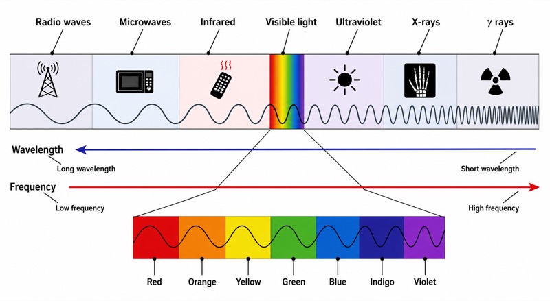
- Radio waves
- Microwaves
- Infrared
- Visible light
- Ultraviolet
- X-rays
- γ rays
- Wavelength
- Long wavelength
- Short wavelength
- Frequency
- Low frequency
- High frequency
- Red–Orange–Yellow–Green–Blue–Indigo–Violet
✓ Accurate labels ✓ Edit text after generation ✓ PNG for papers, posters & slides
 OUTPUT · 16:9 · PNG
What this diagram shows
The electromagnetic spectrum diagram organizes electromagnetic waves by wavelength and frequency. From left to right, it shows Radio waves, Microwaves, Infrared, Visible light, Ultraviolet, X-rays, and γ rays. The wavelength scale runs from Long wavelength to Short wavelength, while the frequency scale runs in the opposite direction, from Low frequency to High frequency. Visible light occupies only a narrow region of the complete spectrum and is expanded to show Red, Orange, Yellow, Green, Blue, Indigo, and Violet. The diagram emphasizes that all these regions are forms of electromagnetic radiation, not fundamentally different kinds of waves.
The arrangement follows the inverse relationship between wavelength and frequency, expressed as c = λf in a vacuum, where c is the speed of light, λ is wavelength, and f is frequency. Therefore, Radio waves have the longest wavelengths and lowest frequencies, while γ rays have the shortest wavelengths and highest frequencies. Photon energy also increases with frequency according to E = hf. Within Visible light, Red has the longest wavelength and lowest frequency, whereas Violet has the shortest wavelength and highest frequency. Although the boundaries between spectral regions are approximate, the sequence and directional relationships must remain consistent.
What a correct diagram must include
- Complete spectral sequence — arrange Radio waves, Microwaves, Infrared, Visible light, Ultraviolet, X-rays, and γ rays in this exact order from long to short wavelength.
- Wavelength direction — add an arrow labeled Wavelength, clearly indicating Long wavelength at the radio-wave end and Short wavelength at the γ-ray end.
- Frequency direction — add a Frequency arrow opposite to the wavelength direction, running from Low frequency to High frequency.
- Expanded visible region — enlarge the narrow Visible light band so that its internal color order can be read clearly.
- Correct visible-color order — show Red–Orange–Yellow–Green–Blue–Indigo–Violet from longer to shorter wavelength.
- Inverse relationship — make the opposed wavelength and frequency arrows visually clear because wavelength decreases as frequency increases.
- Energy relationship — optionally add increasing photon energy toward γ rays, consistent with E = hf.
- Consistent boundaries — use adjacent bands without implying gaps, while recognizing that divisions between regions are conventional and approximate.
Common mistakes
- Reversing the spectrum by placing γ rays at the long-wavelength end and Radio waves at the short-wavelength end.
- Drawing wavelength and frequency arrows in the same direction instead of showing their inverse relationship.
- Reversing the visible-light colors; Red belongs near Infrared, while Violet belongs near Ultraviolet.
- Drawing Visible light as a large fraction of the full spectrum without indicating that it has been expanded for clarity.
- Treating spectral boundaries as exact physical discontinuities, even though electromagnetic radiation varies continuously across the spectrum.
Teaching tips
Use the diagram after introducing transverse electromagnetic waves and before discussing their applications or hazards. Ask students to predict which region has the greatest frequency, longest wavelength, or highest photon energy, and require them to justify each answer using c = λf and E = hf. Then hide selected labels and let students reconstruct the sequence and visible-color order. The diagram directly supports examination questions on spectrum ordering, wavelength–frequency calculations, photon energy, ionizing radiation, and the positions of Infrared and Ultraviolet relative to Visible light.
FAQ about this diagram
Why do wavelength and frequency change in opposite directions?
In a vacuum, all electromagnetic waves travel at the same speed, c. Since c = λf, an increase in frequency requires a proportional decrease in wavelength.
Where do Red and Violet belong within Visible light?
Red is at the long-wavelength, low-frequency edge next to Infrared. Violet is at the short-wavelength, high-frequency edge next to Ultraviolet.
Does higher frequency always mean greater photon energy?
Yes, the energy of an individual photon is E = hf, so photon energy increases with frequency. X-rays and γ rays therefore have more energetic photons than Radio waves or Microwaves.