Unlabeled Bell Curve (Blank Worksheet)
Unlabeled Bell Curve (Blank Worksheet) — an alternative version of the Normal Distribution Bell Curve, generated by AI and fully editable. Download the PNG for quizzes, homework or slides.
✓ Accurate labels ✓ Edit text after generation ✓ PNG for papers, posters & slides
 OUTPUT · 16:9 · PNG
What this diagram shows
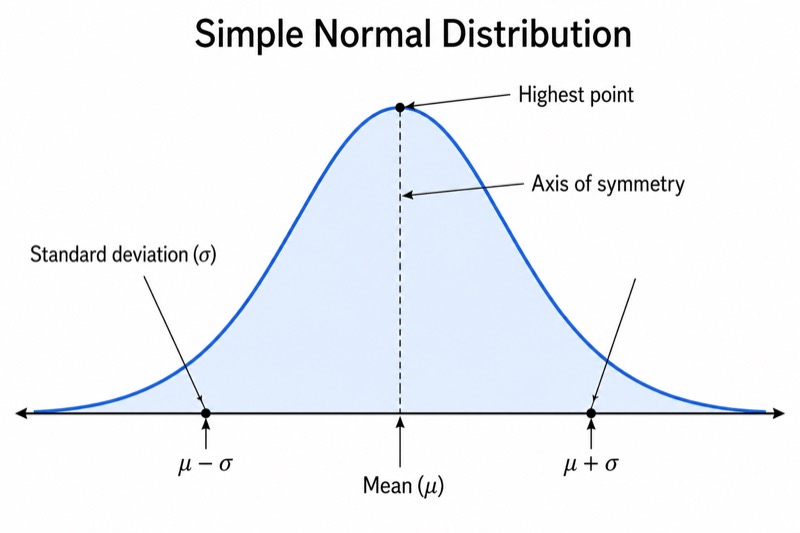
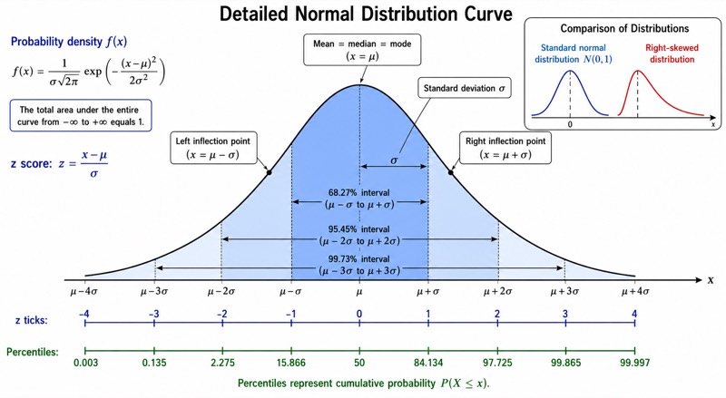
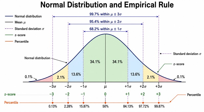
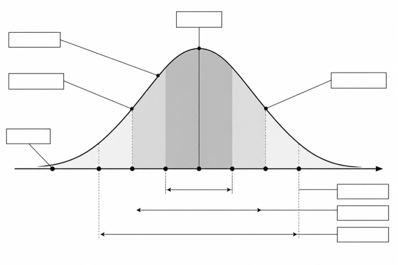
This unlabeled bell curve (blank worksheet) shows the complete structure of a normal distribution without displaying any words, letters, numbers, or percentage values. Unlike the standard main diagram, which identifies the mean, positions from −3σ to +3σ, empirical-rule intervals, shaded regions, and inflection points, this version replaces every answer with an evenly sized blank label box connected by a thin leader line. The curve, axis, boundaries, and light section shading remain visible. Removing the labels turns a reference illustration into an active-recall exercise that reveals whether students understand the diagram rather than merely recognize printed annotations.
Students complete the figure by writing the mean at the center, the standard-deviation positions in order, the 68.2%, 95.4%, and 99.7% intervals, and the two inflection-point locations. They should first use the curve's symmetry to find the center, then move outward in equal standard-deviation steps and match each shaded span to the empirical rule. Unlike the standard labeled diagram, this blank version provides no verbal or numerical prompts, so it is better for retrieval practice, assessment, and error diagnosis. After completion, compare it with the standard main diagram and correct misplaced signs, intervals, or boundary labels.
Teaching tips
- Classroom quiz: Print one copy per student and ask learners to complete every blank box from memory within five minutes, then use the standard labeled diagram as an answer key.
- Homework practice: Assign the worksheet after introducing z-scores and the empirical rule; require students to label the center, all standard-deviation positions, percentage intervals, and inflection points.
- Presentation activity: Place the blank diagram on a slide and invite students to supply one label at a time, explaining how symmetry and distance from the mean justify each answer.
- Review guide or printed handout: Include the blank version beside written questions about areas under a normal curve, allowing students to build their own annotated reference rather than copy the standard main diagram.
- Paper or report preparation: Use the clean blank structure as a drafting template when authors need to add notation specific to their own variables, while keeping the familiar geometry of the normal distribution.
FAQ about this diagram
Why use a blank worksheet instead of the standard labeled bell curve?
The standard main diagram is designed for explanation and reference, whereas this version is designed for recall and assessment. Its empty callout boxes require students to reconstruct the mean, standard-deviation scale, empirical-rule percentages, and inflection points without relying on visible answers.
What should students write in the empty label boxes?
A completed diagram should identify the central mean, the positions from three standard deviations below to three above the mean, and the 68.2%, 95.4%, and 99.7% coverage intervals. Students should also mark the inflection points at one standard deviation on either side of the mean and relate the shaded sections to the corresponding areas.