Simple Bell Curve for Middle School
Simple Bell Curve for Middle School — an alternative version of the Normal Distribution Bell Curve, generated by AI and fully editable. Download the PNG for quizzes, homework or slides.
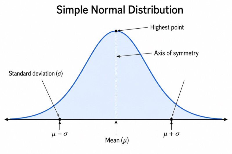
Labels included in this diagram
- Mean (μ)
- μ - σ
- μ + σ
- Standard deviation (σ)
- Axis of symmetry
- Highest point
✓ Accurate labels ✓ Edit text after generation ✓ PNG for papers, posters & slides
 OUTPUT · 16:9 · PNG
What this diagram shows
This simple bell curve for middle school keeps only the essential features of a normal distribution: the mean μ at the center, one standard deviation σ to the left and right, a vertical line of symmetry, the highest point, and light shading under the curve. Unlike the standard main diagram, it omits probability percentages, multiple standard-deviation intervals, detailed tick marks, formulas, and tail labels. This reduced version helps upper-elementary and middle-school students recognize the curve’s basic shape and symmetry before they study calculations or more advanced distribution rules.
Read the diagram from the center outward. The mean μ marks the balance point and lies directly below the curve’s highest point, while the matching σ intervals show equal distances on both sides. The symmetry line emphasizes that the left and right halves have the same shape. Use the figure to discuss how values often cluster near an average and become less common farther away. Compared with the standard main diagram, this version limits interpretation to center, spread, peak, and symmetry, making it better for first explanations rather than numerical probability work.
Teaching tips
- Classroom quiz: ask students to identify μ, locate the two σ intervals, and explain why the highest point lies on the line of symmetry.
- Homework: have students label a blank copy, shade the area under the curve, and write one sentence describing how data cluster around the mean.
- Presentation slide: introduce the shape of a normal distribution before showing the standard main diagram with percentages, additional intervals, or probability calculations.
- Review outline or printed handout: place the simplified figure beside short definitions of mean, standard deviation, peak, and symmetry so students can recall the core structure quickly.
- Introductory report or paper illustration: use the diagram when the text discusses the general idea of a bell-shaped distribution without requiring detailed scales or statistical inference.
FAQ about this diagram
Why does this version show only one standard deviation on each side?
One σ interval on each side is enough to introduce spread while preserving a clear, uncluttered picture. The standard main diagram can be introduced later when students are ready for two or three standard deviations and percentage rules.
Can students use this diagram to calculate probabilities?
Not precisely, because it intentionally omits numerical scales, percentages, and detailed regions. Use it to teach shape, center, symmetry, and basic spread; use the standard main figure or a labeled distribution graph for probability calculations.