Detailed Bell Curve (University Level)
Detailed Bell Curve (University Level) — an alternative version of the Normal Distribution Bell Curve, generated by AI and fully editable. Download the PNG for quizzes, homework or slides.
Labels included in this diagram
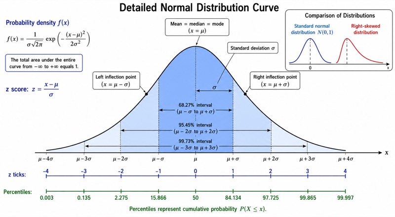
- Probability density f(x)
- f(x)=1/(sigma*sqrt(2*pi))*exp(-(x-mu)^2/(2*sigma^2))
- Mean = median = mode (x=mu)
- Left inflection point (x=mu-sigma)
- Right inflection point (x=mu+sigma)
- Standard deviation sigma
- 68.27% interval (mu-sigma to mu+sigma)
- 95.45% interval (mu-2*sigma to mu+2*sigma)
- 99.73% interval (mu-3*sigma to mu+3*sigma)
- z score: z=(x-mu)/sigma
- z ticks: -4, -3, -2, -1, 0, 1, 2, 3, 4
- Percentiles: 0.003, 0.135, 2.275, 15.866, 50, 84.134, 97.725, 99.865, 99.997
- Standard normal distribution N(0,1)
- Right-skewed distribution
✓ Accurate labels ✓ Edit text after generation ✓ PNG for papers, posters & slides
 OUTPUT · 16:9 · PNG
What this diagram shows
This detailed bell curve (university level) extends the standard main diagram from −3σ to +3σ into a research-oriented view spanning −4σ to +4σ. It identifies the coincident mean, median, and mode at μ; the inflection points μ − σ and μ + σ; z-score and percentile scales; and the probability density function f(x) = [1/(σ√(2π))]e^{−(x−μ)²/(2σ²)}. Nested shading distinguishes the 68.27%, 95.45%, and 99.73% intervals. Tail regions, symmetry, peak density, axis labels, and a standard-normal-versus-skewed inset provide more than twelve named structures. Use this version when the standard figure lacks analytical precision.
Read the horizontal position first as x = μ + zσ, then use the aligned z-score and percentile scales to interpret standardized distance and cumulative probability. The boundaries μ ± σ, μ ± 2σ, and μ ± 3σ delimit the three empirical-rule regions, while μ ± σ also mark changes in concavity rather than probability cutoffs alone. The vertical axis represents probability density, so curve height is not itself probability; probability is area under the curve. Unlike the standard main illustration, this version supports formal calculations, distribution diagnostics, and comparison with skewed data. The inset also clarifies why empirical-rule percentages should not be transferred automatically to non-normal distributions.
Teaching tips
- In-class quiz: ask students to identify the z score, approximate percentile, empirical-rule region, or inflection point associated with a marked observation, and require them to distinguish density from area.
- Homework: use the aligned x, σ, z-score, and percentile scales to practice standardization with z = (x − μ)/σ and to estimate central, one-tailed, and two-tailed probabilities.
- Lecture slides: reveal the 68.27%, 95.45%, and 99.73% shaded layers sequentially, then contrast the symmetric normal curve with the skewed inset to discuss when the empirical rule is valid.
- Review outline or printed handout: annotate the coincidence of mean, median, and mode, the points μ ± σ, tail behavior, symmetry, concavity, and the role of parameters μ and σ beside the density formula.
- Research paper or university report: use the figure as a conceptual illustration of normal-model assumptions, standardized scores, percentile interpretation, or departures from normality; report actual fitted parameters and diagnostics in the accompanying text.
FAQ about this diagram
How is this university-level bell curve different from the standard main diagram?
The standard diagram emphasizes the basic −3σ to +3σ shape and the rounded 68.2%–95.4%–99.7% rule. This version extends to ±4σ, uses the more precise 68.27%–95.45%–99.73% values, adds z scores, percentiles, inflection points, the density formula, tail structure, and a skewness comparison, making it suitable for formal statistical reasoning.
Why use this detailed version instead of a simpler bell curve?
Use it when learners must connect geometry, standardization, cumulative probability, and model assumptions rather than merely recognize a bell shape. Its extra scales and annotations support university coursework and research communication, while the standard main figure remains preferable for an introductory overview or a visually uncluttered first explanation.