Scientific Poster Examples: Layouts, Sizes, Checklist
The most useful scientific poster examples do more than look polished: they reveal a clear information hierarchy. A reader should be able to identify the research question, main result, and significance within seconds, then choose whether to examine the methods, figures, or supporting details. This guide breaks down practical formats for graduate researchers preparing conference posters, students completing assignments, and teachers creating research-based classroom materials.
You will learn how to build a classic three-column poster, when to use the 'Better Poster' approach, and how to choose between portrait and landscape orientation. The guide also covers A0, A1, 36×48-inch, and 42×48-inch formats; explains what belongs in each section; proposes a workable balance among text, graphics, and whitespace; and provides a print-ready quality-control process.
Treat every example as a design pattern rather than a rigid template. Your discipline, evidence, audience, venue, and presentation format should shape the final result. Most importantly, check the organizer's specifications before designing: conferences set maximum dimensions and orientation, and those requirements take priority over general design advice.
How to Evaluate Scientific Poster Examples
When reviewing scientific poster examples, begin with hierarchy rather than decoration. Stand back from the screen or reduce the page to thumbnail size. Can you still locate the title, central finding, key figure, and conclusion? If every box has equal visual weight, the poster may contain good research but still force readers to work too hard. Strong hierarchy typically uses position, scale, spacing, and contrast to establish a deliberate reading order.
Next, trace the path a viewer is expected to follow. A conventional poster usually moves from the upper left across columns, while a conclusion-led design may direct attention to a central statement first. Arrows and numbered panels can help when the sequence is not obvious, but they should not compensate for a confusing structure. Each major visual should also have a nearby caption or interpretive statement so readers do not have to search elsewhere for its meaning.
Finally, evaluate whether the example would work in a crowded room rather than only on a laptop. Use a title of at least 72pt, body text of at least 24pt, and make sure it can be read clearly from 1.5 meters away. Print one representative section at actual size before committing to the entire poster; this exposes undersized labels, weak contrast, pixelated images, and overly dense paragraphs.
- Identify the first, second, and third elements your eye notices.
- Check whether the research question and main result are understandable without an oral explanation.
- Look for a clear reading path rather than a collection of equally prominent boxes.
- Inspect figures for readable labels, units, legends, and captions.
- Confirm that color supports hierarchy and does not carry meaning by itself.
Classic Three-Column Scientific Poster Examples
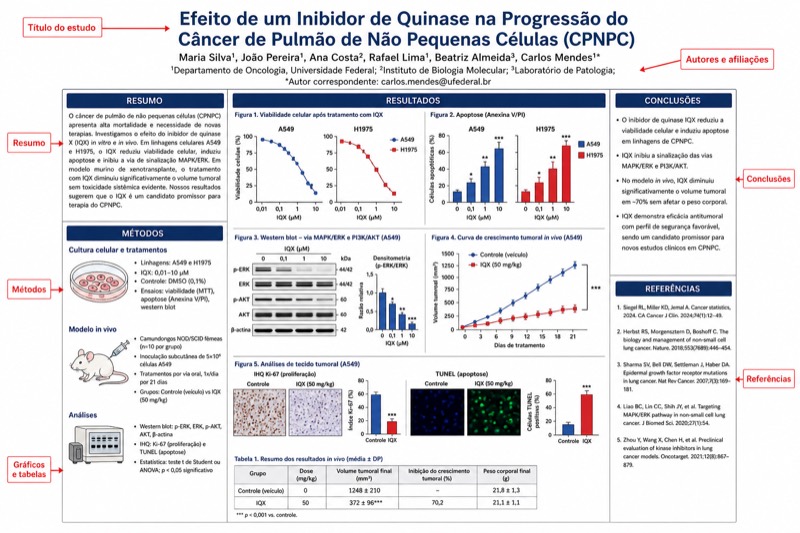
The classic three-column format is effective when a project follows a familiar research sequence and includes several methods, results, or figures. A common structure places background and objectives in the left column, methods and primary results in the center, and additional results, discussion, and conclusions in the right column. The title, author information, and affiliations usually span the top, creating a stable header above the reading grid.
Build the columns from a consistent underlying grid, but do not turn every section into an identical box. The central results deserve more area and visual emphasis than references or acknowledgments. You can let an important graph span more than one column, provided the reading order remains clear. Use aligned edges and consistent gaps so the layout feels organized even when individual sections have different heights.
This format is especially practical for a thesis project, laboratory study, systematic classroom investigation, or assignment whose rubric asks for standard academic sections. Its main risk is overcrowding. If a section needs several long paragraphs, move secondary explanations into the spoken presentation, a handout, or a linked document rather than shrinking the type.
- Left column: context, knowledge gap, research question, and objectives.
- Center column: method overview and the strongest one or two result figures.
- Right column: remaining results, interpretation, limitations, and conclusion.
- Top band: concise title, authors, affiliations, and only necessary logos.
- Bottom area: references, acknowledgments, contact details, and optional QR code.
The 'Better Poster' Large-Conclusion Layout
'Better Poster' is a layout proposed by Mike Morrison in 2019: the central area presents the core conclusion in large text, while the sides contain details and a QR code. Instead of asking viewers to read the entire study before discovering the answer, it makes the principal message immediately visible. This can work well when the research has one defensible, specific takeaway that can be expressed in a short sentence.
The central statement should report the finding rather than announce a topic. For example, 'Treatment X reduced the measured response under Y conditions' communicates more than 'Results' or 'Effects of Treatment X.' Avoid claiming more than the evidence supports, and include essential qualifiers when they change the interpretation. The side panels can then show the research question, selected methods, one or two supporting visuals, limitations, references, and a route to further information.
A QR code should be supplementary, not the only location of essential evidence. Link it to a stable destination such as a paper, preprint, project page, data repository, or accessible summary, and test it on multiple phones before printing. Add a short text label explaining what the code opens. If a class, department, or conference expects conventional headings, adapt the concept without removing required content; 以官方指南为准 (follow the official guidelines).
- Use one central sentence that a passerby can understand quickly.
- Keep supporting evidence close enough to verify the central claim.
- Place technical depth, references, and extended methods in the side areas.
- Use a descriptive call to action beside the QR code.
- Do not let the oversized conclusion become broader or stronger than the data.
Portrait vs. Landscape Scientific Poster Examples
Portrait orientation suits narrow display spaces and naturally supports vertical columns. It is often comfortable for a conventional top-to-bottom research narrative and can provide long column depth for methods, results, and discussion. However, wide charts, timelines, imaging sequences, and complex workflows may become cramped if forced into narrow panels.
Landscape orientation provides more horizontal room for side-by-side comparisons, process diagrams, panoramic images, and conclusion-centered layouts. It can also support a left-to-right story with fewer vertical jumps. Its weakness is that long lines of text become tiring, so text should still be divided into controlled columns or compact blocks rather than stretched across the full width.
Choose orientation by combining three tests. First, check what the event permits. Second, identify the natural shape of your most important evidence. Third, sketch both orientations as rough rectangles before styling anything. Conferences specify maximum size and orientation, so follow conference requirements. If the venue supplies any different dimensional, file, or mounting rule, 以官方指南为准 (follow the official guidelines).
- Choose portrait when the display area is narrow or the content fits a vertical column sequence.
- Choose landscape for wide figures, horizontal workflows, or side-by-side comparisons.
- Never rotate the design after completion without checking text size, figure scale, and reading order.
- Reserve space for mounting or display hardware if the organizer requires it.
- Design to the final orientation from the beginning whenever possible.
Choosing A0, A1, 36×48, or 42×48
Common poster sizes: A0 is 841×1189 mm, A1 is 594×841 mm, and North American conferences commonly use 36×48 inches or 42×48 inches. Conferences specify maximum size and orientation, so conference requirements control. Do not assume that a commonly used size will fit the assigned board, and do not select a format solely because a template is readily available.
Choose the largest permitted size only when the content benefits from it. A larger canvas can support bigger figures and more comfortable spacing, but it should not become an excuse to add every analysis. A1 can be appropriate for a smaller assignment, corridor display, or setting with restricted space, while A0 and the listed North American formats provide more area for conference-style communication. The organizer's instructions remain decisive.
Set the document to its final dimensions before laying out content. Scaling a small design upward can expose low-resolution images, while scaling a large design downward can make body text and figure labels unreadable. Ask the printer whether the submitted file must include any particular margin, bleed, color profile, or file format. These production details vary, so 以官方指南为准 (follow the official guidelines) and use the printer's official specifications.
- Copy the permitted width, height, and orientation from the event instructions.
- Create the canvas at final size before importing figures.
- Confirm whether the dimensions describe the maximum size or a required exact size.
- Check that every chart remains readable when placed at its intended printed dimensions.
- Request an actual-size proof section when a full proof is impractical.
What to Put in Every Poster Section
The title should name the subject and, when possible, indicate the relationship or finding being studied. Under it, list authors and affiliations exactly as required by your institution or event. The introduction should establish context, identify the specific gap, and lead directly to a research question, objective, or hypothesis. It is not a miniature literature review; retain only information necessary to understand why the project was conducted.
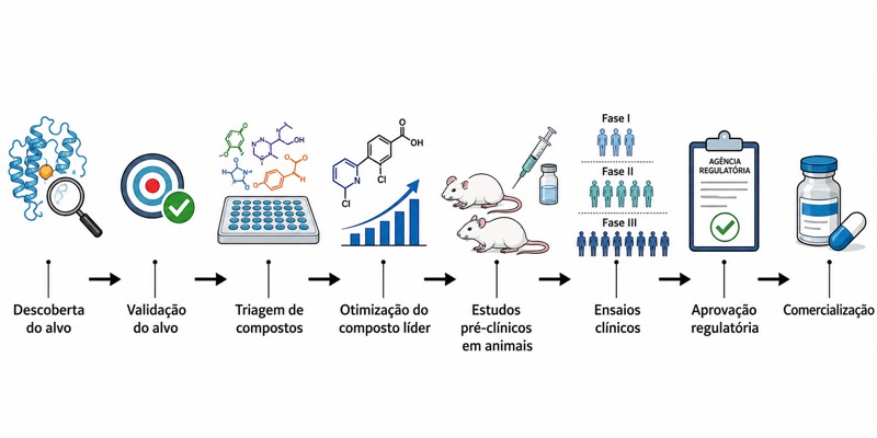
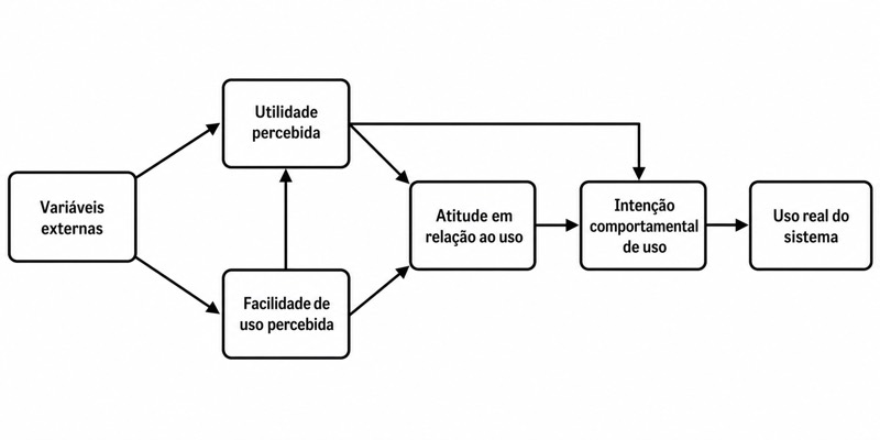
Methods should let readers understand the study design without reproducing a full protocol. Replace procedural prose with a workflow, study diagram, timeline, or compact list when that representation is clearer. Report the elements needed to interpret the results, such as the study groups, measured variables, materials, analytical approach, and relevant controls. Requirements for human-subject, animal, safety, funding, or disclosure statements vary, so 以官方指南为准 (follow the official guidelines).
Results should occupy the most valuable space because they contain the evidence. Give each figure a message-based heading, such as 'Response increased after exposure,' rather than a neutral label such as 'Graph 2.' The conclusion should answer the stated question, distinguish evidence from interpretation, acknowledge major limitations, and explain the significance without introducing unsupported claims. References, acknowledgments, and contact information should remain legible but visually secondary.
- Background: only the context needed to understand the problem.
- Objective: one direct question, hypothesis, or study aim.
- Methods: design, sample or materials, measurements, controls, and analysis.
- Results: selected evidence with readable captions and interpretive headings.
- Conclusion: answer, significance, limitations, and a justified next step.
- Footer: key references, acknowledgments, disclosures, contact details, and optional QR code.
Balancing Figures, Text, and Whitespace
Plan the poster around evidence rather than writing all the prose first. As a practical drafting heuristic, not a conference rule, you might allocate roughly 40–50% of the usable area to figures and tables, 25–35% to text and headings, and 20–30% to whitespace. The exact balance depends on the research and venue, and any formal requirement should follow the official guidelines. The goal is not to hit a mathematical quota but to prevent text from consuming every available gap.
Whitespace includes outer margins, gaps between columns, padding inside sections, and open space around high-priority figures. It separates ideas and makes the hierarchy visible. Consistent spacing is usually more effective than decorative borders, shadows, or numerous background colors. If a poster feels crowded, remove repeated explanations, combine overlapping sections, simplify captions, or enlarge one key result while deleting weaker visuals.
Use figures that answer a question, not images added for decoration. Simplify chart titles, eliminate redundant legends, label important values directly when appropriate, and keep units visible. Tables are best for precise lookup; charts are usually better for patterns and comparisons. Photographs and scientific illustrations should have a clear purpose, adequate resolution, necessary scale information, and permission or attribution where applicable.
- Give the strongest result the largest visual area.
- Keep related text, legend, and figure within the same visual neighborhood.
- Use consistent internal padding across sections.
- Remove unnecessary chart gridlines, duplicate labels, and decorative imagery.
- Check color contrast and ensure categories remain distinguishable without relying only on hue.
- View the complete poster at thumbnail size and inspect critical sections at actual print size.
Print-Ready Poster Checklist
Begin technical checks before the deadline rather than after the design is complete. Confirm the final dimensions, orientation, file type, submission method, and any venue-specific production instructions. Embed or outline fonts only when the chosen workflow and printer recommend it, and inspect the exported file on another device. A correct editing file does not guarantee a correct exported file.
Review the poster in two modes. At full-page view, assess hierarchy, alignment, balance, and reading order. At actual size, inspect body text, figure labels, mathematical symbols, superscripts, subscripts, line weights, image quality, and QR-code clarity. Also proofread author names, affiliations, contact information, axis units, statistical notation, reference details, and acknowledgments.
Export a final version, then reopen that exact exported file rather than assuming it matches the source. Print a small proof for overall color and a 100% scale crop for typography and figures when feasible. Printing services differ in accepted formats, turnaround, color handling, margins, and other production details; 以官方指南为准 (follow the official guidelines) and confirm uncertain requirements directly with the printer.
- Verify dimensions and orientation against the conference instructions.
- Confirm a title of at least 72pt and body text of at least 24pt.
- Test readability from 1.5 meters away.
- Check images, equations, symbols, units, captions, and figure numbering.
- Test every QR code using more than one device.
- Check contrast and review a grayscale version for color-dependent problems.
- Reopen and inspect the final exported file at full-page and actual-size views.
- Save a backup locally and in an accessible secondary location.
Perguntas sobre este diagrama
What should I include on a scientific poster?
Include a clear title, authors and affiliations, brief background, objective or research question, essential methods, selected results, conclusion, limitations, references, acknowledgments, and contact information. Give results the most space, and include only the context and methods needed to interpret them.
Should I use A0 or 36×48 inches for my research poster?
Use the size required or permitted by the event. A0 is 841×1189 mm, while 36×48 inches is commonly used at North American conferences; they are not interchangeable specifications. Conferences set maximum dimensions and orientation, so 以官方指南为准 (follow the official guidelines).
Is portrait or landscape better for a scientific poster?
Portrait works well for vertical columns and narrow display spaces, while landscape is useful for wide charts, workflows, and side-by-side comparisons. Sketch both around your primary figure, but first confirm which orientation the conference permits.
How much text is too much on a scientific poster?
It is too much when readers cannot identify the question, main result, and conclusion quickly or when text must be reduced below readable size. Keep the title at least 72pt and body text at least 24pt, and test the poster from 1.5 meters away. Move secondary detail to your spoken explanation or a linked resource rather than filling every open space.