Best Fonts for Scientific Posters (2026): Sizes, Pairings and Free Alternatives
Choosing the best fonts for scientific posters is not mainly a question of style. It is a question of whether a reader can understand your title, methods, results, and figures while standing several steps away. A typeface that looks elegant on a laptop may become thin, crowded, or ambiguous after the poster is printed. Font choice therefore has to be considered together with size, weight, spacing, color contrast, and the physical viewing distance.
For a typical academic poster, common readability recommendations are: 72-120pt for the title, 48-80pt for subtitles, 24-32pt for body text, and no smaller than 18pt for captions. The body text should remain readable from 1.5-2 metres away. These are useful working ranges rather than substitutes for testing because the apparent size of a font also depends on its x-height, stroke thickness, width, and print quality.
This guide is written for graduate researchers preparing conference posters, students completing scientific assignments, and teachers creating slides or classroom graphics. It explains why sans-serif fonts usually perform well at a distance, how to build a reliable size hierarchy, what to check before journal submission, and how to combine English and Chinese without making either language look secondary or inconsistent.
Quick answer: fonts and sizes that work on a scientific poster
If you only read one section: use one sans-serif family for everything, set the title at 85–100 pt, section headings at 48–60 pt, body text at 28–32 pt and captions no smaller than 20 pt on an A0 or 36 × 48 inch poster, and print a single A4 section at 100 % to check it before the full print. The sizes below assume the poster is read from about 1.5 metres.
Fonts that consistently work: Helvetica or Arial, Calibri, Source Sans 3, Open Sans, Roboto, Lato and Inter. All of the Google Fonts in that list are free, embed cleanly in PDF, and have the bold weights you need for headings. Avoid Times New Roman for body text on a poster (too thin at distance), decorative fonts everywhere, and condensed fonts for anything but a crowded axis label.
- Title: 85–100 pt bold, one line if possible, sentence case
- Authors and affiliations: 40–48 pt regular
- Section headings: 48–60 pt bold
- Body text: 28–32 pt regular, line spacing 1.15–1.3, columns 40–60 characters wide
- Figure captions and axis labels: 20–24 pt, never below 18 pt
- References and acknowledgements: 18–20 pt is acceptable — nobody reads them from a distance
Safe font pairings and free alternatives to Helvetica
The safest poster typography is a single sans-serif family in two weights: bold for headings, regular for text. If you want a second family for contrast, pair a sans-serif for headings with a sturdy serif for body text, and never use more than two families on one poster.
You do not need to buy Helvetica. Every pairing below uses fonts that are free to download and to embed, which also avoids the classic failure where the print shop's computer substitutes a missing font and reflows the whole poster.
- One-family, zero-risk: Source Sans 3 Bold + Source Sans 3 Regular (free Helvetica-class alternative)
- Modern and compact: Inter Bold + Inter Regular — good when text is dense
- Warm and readable: Lato Bold + Lato Regular
- Sans headings + serif body: Open Sans Bold + Source Serif 4 Regular
- Bilingual English + Chinese: Source Sans 3 + Noto Sans SC (same design family, matching weights)
- Bilingual English + Japanese: Inter + Noto Sans JP
Why the Best Fonts for Scientific Posters Are Often Sans Serif
Sans-serif fonts are frequently preferred for posters because their letterforms are relatively simple and their strokes tend to remain clear when viewed from a distance. Decorative details that look attractive at reading distance can become visual noise across a room, especially when the text is printed over a colored background or placed beside dense scientific figures. Helvetica/Arial and Calibri are common sans-serif choices because they are familiar, widely readable, and available in useful families of weights.
The advantage does not come from the absence of serifs alone. Effective poster fonts usually have open counters, distinguishable characters, moderate width, and enough stroke weight to survive printing. Check letters and numbers that are easy to confuse, including capital I, lowercase l, the numeral 1, capital O, and zero. This is especially important in gene names, sample identifiers, equations, chemical labels, and axis annotations, where a single ambiguous character can change the meaning.
Serif fonts are not automatically unsuitable. A strong serif face can work for a short title or a restrained accent, but long poster paragraphs are usually safer in a clean sans serif. Avoid using a thin, condensed, script, or highly geometric display font for body text. If your visual identity requires an expressive title font, pair it with a neutral sans serif for everything that readers must scan quickly.
- Use regular or medium weight for most body text; reserve bold for headings and short emphasis.
- Avoid light and ultra-light weights, which can disappear under glare or imperfect printing.
- Prefer open letterforms and clear differences between similar letters, numerals, and symbols.
- Limit the poster to one font family or two carefully matched families.
- Print a sample at actual size before committing to the complete poster.
Set Minimum Sizes for Titles, Body Text, and Captions
A dependable poster hierarchy begins with realistic minimum sizes. Common readability recommendations are 72-120pt for the title, 48-80pt for subtitles, 24-32pt for body text, and no smaller than 18pt for captions. The body should be readable while the viewer stands 1.5-2 metres away. Do not reduce the entire poster simply because the first draft contains too much text; edit the content, reorganize the layout, or enlarge the canvas instead.
Point size is only a starting measurement. Two fonts set at 28pt can look noticeably different because one has a large x-height and broad characters while the other has small lowercase forms and narrow strokes. Judge the type at final printed size, not at an arbitrary zoom level. A practical test is to export one representative column, print it at 100 percent, attach it to a wall, and check it from the intended viewing distance.
Build the hierarchy before polishing the visual style. Assign a consistent size and weight to each level, including the main title, section headings, body, captions, axis labels, legends, and references. If two elements have the same importance, format them the same way. If an item is less important, reduce its prominence with size or weight, but never make essential information unreadably small.
- Title: 72-120pt.
- Subtitle or major secondary heading: 48-80pt.
- Body text: 24-32pt.
- Figure captions: no smaller than 18pt.
- Viewing test: body text should be readable from 1.5-2 metres away.
- When space is limited, shorten the wording before shrinking the type.
How to Test the Best Fonts for Scientific Posters
Do not choose a poster font by inspecting only the alphabet or your title. Create a test block that resembles real scientific content: a short methods paragraph, a sentence containing italics, several bold labels, numbers with decimals, units, Greek letters, subscripts, superscripts, and a sample citation. If you work in a bilingual context, include both English and Chinese in the same test. This reveals missing glyphs and mismatched weights before they spread through the layout.
Compare candidates under realistic conditions. View the page at final dimensions, print a crop at actual size, and inspect it from nearby, middle, and distant positions. Ask another person to read a paragraph rather than simply saying whether the design looks good. Reading errors, hesitation, or skipped lines are more useful evidence than personal preference.
The best fonts for scientific posters should also support a coherent family structure. Regular, italic, medium, semibold, and bold styles allow you to create emphasis without introducing unrelated typefaces. Confirm that scientific symbols, mathematical notation, and punctuation are available. If a fallback font appears automatically for one symbol, its baseline, width, or stroke may look inconsistent.
- Test real research content rather than placeholder text.
- Include uppercase and lowercase letters, numerals, symbols, units, and references.
- Inspect regular, italic, bold, superscript, and subscript styles.
- Check the printed output under the lighting expected at the venue.
- Confirm that exported files preserve or embed the intended fonts.
Treat Figure Labels and Captions as Part of the Poster
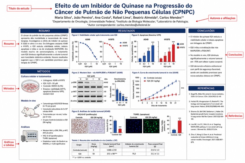
A poster often fails because the main text is readable while the figures are not. Axis labels, legends, panel letters, annotations, and captions need the same attention as the body. Figures copied from a manuscript may contain text designed for a small journal page, while figures copied from a presentation may use sizes that change unpredictably when resized. Rebuild or edit the labels after placing each figure at its final poster dimensions.
Use consistent terminology and formatting across all visuals. If one chart uses abbreviated units, sentence-case labels, and semibold panel letters, the other charts should follow the same system unless the science requires a difference. Keep text horizontal when possible, place legends close to the data they explain, and avoid squeezing long category names into a narrow axis. Direct labeling can sometimes remove the need for a separate legend and reduce the reader's eye movement.
Captions should explain what the viewer needs in order to interpret the image, not repeat the entire results section. Start with the figure's main message, identify panels and experimental groups, define uncommon abbreviations, and state the meaning of error bars or symbols where relevant. On a poster, captions must be no smaller than 18pt under the common readability recommendation, even if that requires editing them for length.
- Resize the figure first, then set its labels for the final displayed dimensions.
- Use one labeling system for axes, legends, callouts, and panel letters.
- Do not rely only on color to distinguish experimental groups.
- Keep essential labels visible without requiring the reader to inspect a distant legend.
- Check that subscripts, superscripts, minus signs, and Greek letters export correctly.
Separate Poster Typography from Journal Figure Rules
Poster text and manuscript figure text serve different viewing conditions. A poster is read from a distance and therefore needs relatively large type. A journal figure is judged at its final publication size, which may be much smaller than the size used while drawing it. Reusing one file without adjusting the typography can produce either tiny poster labels or oversized journal annotations.
Nature and Science require fonts in submitted figures to be no smaller than 5-7pt at final size, with some variation between journals; check the journal's author guidelines before submission. Do not treat this range as a universal specification for every publication, and do not assume that two journals from the same publisher use identical requirements. Exact rules for font family, final dimensions, line thickness, file format, resolution, and color mode must be verified in the official instructions; 以官方指南为准.
Create separate output versions when the same visual is used in a poster, paper, slide deck, and classroom handout. Keep an editable master with live text and organized layers, then generate each version at its intended dimensions. This takes longer than scaling a flattened image, but it prevents distorted labels, inconsistent line weights, and unreadable annotations.
Journal figures live at 8–10 pt after reduction, so the poster sizes above do not transfer. If you generate figures with an AI tool such as Science Diagram, regenerate at 2K for a poster and keep the 1K version for the manuscript rather than scaling one file for both; our guide to figures for Nature and Science journals covers the journal side in detail.
- Set journal figure text according to the final publication dimensions.
- For Nature and Science, submitted figure fonts should be no smaller than 5-7pt at final size, with variation between journals.
- Verify all exact journal requirements in the official author guidelines; 以官方指南为准.
- Maintain separate poster, manuscript, slide, and handout exports.
- Keep the editable source so that labels can be resized without degrading the figure.
Pair English and Chinese Type Without Visual Conflict
English-Chinese typesetting works best when both scripts have a compatible visual voice rather than an identical nominal point size. Latin text is strongly influenced by x-height, while Chinese characters fill a more square visual area. As a result, English and Chinese set at the same point size may not appear equally large or equally dark. Compare their visible height, stroke density, and baseline relationship, then make small optical adjustments instead of assuming that the software's number guarantees balance.
For scientific posters, a practical pairing is a readable Latin sans serif with a CJK sans-serif family that contains complete Chinese glyphs and several usable weights. Match the families by overall openness and stroke character: a neutral Latin face usually pairs better with a neutral Chinese face than with a highly calligraphic one. Check regular and bold text side by side because nominally matching weights can have very different visual darkness.
Mixed-language punctuation and line breaking require manual review. Avoid leaving opening punctuation at the end of a line or closing punctuation at the beginning. Check spacing around English abbreviations, numbers, units, and Chinese text consistently, and prevent short English terms from creating awkward gaps. If a technical term is introduced in both languages, define the translation once and use the same version throughout the poster.
- Pair sans serif with CJK sans serif for a consistent scientific tone.
- Match visual size and darkness, not only the displayed point-size value.
- Verify that bold Chinese and bold English have comparable emphasis.
- Check Chinese punctuation, Latin punctuation, line breaks, and spacing manually.
- Use fonts with complete glyph coverage to prevent unexpected fallback characters.
- Proofread bilingual terminology for consistency across text, figures, and captions.
Use a Repeatable Proofing and Export Workflow
Typography should be tested as part of the production workflow, not left until the final export. Start by defining a small style system for the title, headings, body, captions, labels, and references. Apply those styles consistently, place the figures at final size, and then review the poster in several modes: a fit-to-screen overview for hierarchy, actual-size inspection for detail, and a physical distance test for readability.
Check contrast in the conditions where the poster will be used. Thin gray text may look refined on a bright monitor but fade on a matte print or under exhibition lighting. Use sufficiently dark text against light backgrounds or sufficiently light text against dark backgrounds. Reserve colored text for short labels or emphasis, and confirm that important categories remain distinguishable when printed in grayscale or viewed by someone with limited color discrimination.
Before delivery, export a print-ready file and inspect the exported version rather than trusting the editable document. Look for missing glyphs, font substitution, clipped descenders, shifted line breaks, altered symbols, and rasterized text. Confirm dimensions, bleed, margins, resolution, and file-format requirements with the printer or receiving organization; exact production specifications vary, so 以官方指南为准.
For the layout itself, start from a scientific poster layout template or a graphical abstract and only then set type; typography decisions are far easier once the grid exists.
- Define type styles before filling the complete poster with content.
- Review the layout at overview scale, actual size, and from 1.5-2 metres away.
- Print a representative crop that includes text, figures, captions, and color.
- Inspect the final exported file for substitutions and layout shifts.
- Confirm printer, conference, school, or submission specifications; 以官方指南为准.
- Ask a reader unfamiliar with the project to identify the main conclusion in under a minute.
Perguntas sobre este diagrama
What is the best font for a scientific research poster?
A clean sans-serif such as Helvetica/Arial, Calibri, Source Sans 3, Inter or Lato, used in bold for headings and regular for body text. Free Google Fonts in this list embed reliably and avoid font substitution at the print shop.
What font size should I use for an academic poster?
For an A0 or 36 × 48 inch poster read from about 1.5 m: title 85–100 pt, section headings 48–60 pt, body text 28–32 pt, captions and axis labels 20–24 pt, and nothing below 18 pt.
Is Times New Roman a good poster font?
Not for body text: its thin strokes and small x-height lose contrast at distance. A sturdy serif such as Source Serif 4 or Georgia works if you want a serif body paired with sans-serif headings.
Can I use the same font sizes for poster and journal figures?
No. Journal figures are typeset at roughly 8–10 pt after reduction and follow the journal's own rules; poster type is three to four times larger. Make two versions rather than scaling one file.
How do I match English and Chinese fonts on a poster?
Use families designed together, such as Source Sans 3 with Noto Sans SC, so stroke weights and x-heights match. Set Chinese body text one or two points larger than the Latin text and keep the same line spacing.