How to Make Scientific Diagrams for Research Papers
Learning how to make scientific diagrams for research papers is not mainly about drawing attractive shapes. It is about turning a research question, mechanism, workflow, or result into a visual argument that readers can understand quickly and accurately. A successful figure has a defined purpose, a deliberate information hierarchy, consistent labels, technically valid output files, and a caption that explains the figure without forcing readers to search the main text.
This process matters whether you are a graduate student preparing a manuscript, a student completing an assignment, or a teacher developing lecture slides. The level of detail may change, but the central workflow is the same: identify the question, select the evidence, organize the visual sequence, test readability, and verify the submission specifications. Starting with software before making these decisions often produces crowded figures that require extensive revision.
The following workflow takes a scientific diagram from initial concept to journal submission. It includes practical planning methods, annotation rules, file preparation, caption writing, and a final quality-control checklist designed to prevent common reviewer and production objections.
1. How to Make Scientific Diagrams for Research Papers: Start With One Question
Before opening a drawing, slide, vector, or illustration tool, write down the exact question the figure must answer. For example: What steps were used to prepare the samples? How does the proposed mechanism proceed? Which variables differ between the control and treatment groups? Where is a structure located within a larger system? If you cannot express the figure’s purpose as one clear question, the figure is probably trying to perform too many jobs.
Next, write a one-sentence answer to that question. Treat this sentence as the figure’s main claim. Every panel, arrow, label, icon, image, and color should help establish that claim. Material that is accurate but not necessary belongs in the methods, supplementary information, caption, or another figure. This test is especially useful for students, who often try to demonstrate effort by including every experimental detail.
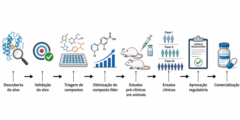
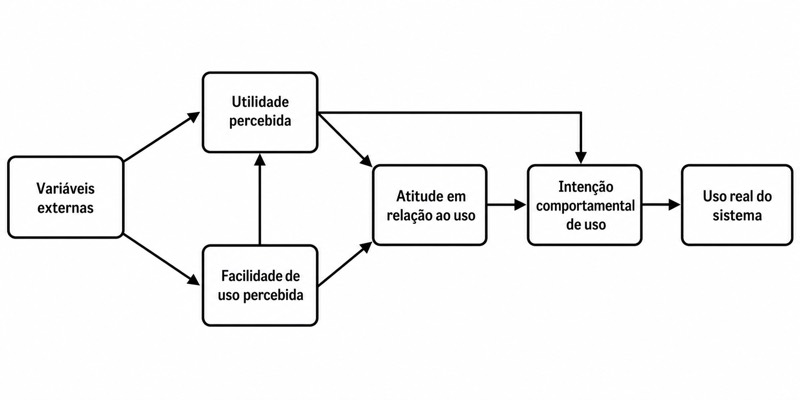
Decide what type of figure best communicates the answer. A process is usually clearer as a directional workflow; a physical arrangement may need a cutaway or spatial diagram; a comparison may require aligned panels; and a multistage mechanism may need numbered states. Sketch two or three rough layouts on paper before creating a polished version. At this stage, boxes and arrows are enough because the goal is to compare structures, not visual styles.
- Write one question that the figure must answer.
- Write one sentence stating the intended takeaway.
- Identify the minimum evidence needed to support that takeaway.
- Choose a visual structure: workflow, mechanism, comparison, hierarchy, map, or annotated image.
- Remove elements that do not change the reader’s interpretation.
2. Build an Information Hierarchy Before Adding Detail
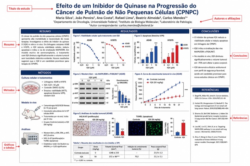
A scientific figure should guide the reader through information in a planned order. Establish the primary level first: the major stages, experimental groups, anatomical regions, or conceptual components. Add secondary information such as conditions, measurements, or molecular interactions only after the primary path is understandable. Tertiary details, including qualifications and technical notes, should be visually quieter or moved into the caption.
Use position before decoration. Readers generally follow familiar arrangements such as left to right, top to bottom, or from a central object toward surrounding branches. If the sequence changes direction, show that change explicitly with arrows, numbering, panel letters, or spacing. Do not rely only on color to establish order, because color may be lost in grayscale output or may not be distinguishable to every reader.
A useful editing exercise is the three-pass test. In the first pass, view the figure at a small size and identify only the main message. In the second, follow the path between components and check whether the sequence is unambiguous. In the third, inspect labels and supporting details. If readers must begin with tiny text before understanding the major structure, reverse the hierarchy and make the main stages more prominent.
- Create a clear entry point, such as panel A, a title-like heading, or the first step of a workflow.
- Keep related objects close together and separate unrelated groups with consistent space.
- Align panels, boxes, baselines, and labels to make relationships visible.
- Use no more visual levels than the scientific argument requires.
- Ask a colleague to explain the figure without reading the manuscript.
3. Standardize Labels, Symbols, Arrows, and Color
Consistency is more important than decoration. Use the same term, abbreviation, capitalization pattern, and typographic treatment whenever an item appears more than once. If the manuscript calls a group “untreated control,” the figure should not alternate between “control,” “baseline,” and “untreated” unless those terms have distinct meanings. Define abbreviations at first use in the caption and avoid inventing abbreviations merely to save a small amount of space.
Give every visual convention a stable meaning. For example, a solid arrow might indicate movement, a dashed arrow a proposed relationship, and a blunt-ended line inhibition. However, these meanings are not universal in every discipline, so explain them in a key or caption. Avoid using the same arrow style for physical movement, chronological progression, chemical conversion, and statistical association within one figure.
Use color as reinforcement rather than as the only carrier of information. Pair color differences with labels, shapes, patterns, line styles, or spatial separation. Check whether the figure remains interpretable in grayscale and under common forms of color-vision deficiency. Keep background colors subtle, preserve strong contrast between text and its background, and avoid decorative gradients that could be mistaken for quantitative scales.
- Use one readable typeface family and a limited set of font weights.
- Keep text horizontal whenever space allows.
- Use panel letters consistently and place them in equivalent positions.
- Create a legend for unfamiliar symbols, patterns, colors, or line styles.
- Check scientific notation, units, subscripts, superscripts, Greek letters, and italicized variables.
- Do not use a decorative icon if a simple, accurately labeled shape communicates the concept more precisely.
4. Draw Accurate Relationships Without Overclaiming
Scientific diagrams simplify reality, but simplification must not change the scientific meaning. Distinguish observations from interpretations and established mechanisms from hypotheses. If an interaction is proposed rather than demonstrated, indicate that status through wording and a defined visual convention. A confident solid arrow can unintentionally present a tentative relationship as proven.
Preserve meaningful scale and orientation where they affect interpretation. If objects are not drawn to scale, state that clearly when the omission could mislead the reader. In microscopy or spatial figures, include scale information when required and make sure resizing does not separate a scale bar from the image it describes. In process diagrams, do not imply equal duration merely because all steps occupy equal space unless equal duration is part of the result.
When combining experimental images, plots, and explanatory drawings, make the boundaries between evidence and illustration obvious. Do not redraw measured results as a conceptual curve without identifying it as schematic. Do not stretch, crop, recolor, or selectively enhance images in a way that changes the apparent result. Keep original source files and document any permitted processing so the figure can be audited or revised.
- Label hypothetical pathways as proposed, predicted, or putative when appropriate.
- Distinguish experimental input, operation, output, and interpretation.
- State when a drawing is schematic or not to scale.
- Retain unedited source images and editable figure files.
- Check that arrows express the intended relationship rather than merely filling empty space.
5. Prepare Resolution, File Format, and Color Mode Correctly
Technical preparation is a core part of how to make scientific diagrams for research papers because a clear design can still fail production checks if it is exported incorrectly. Keep diagrams as vectors for as long as possible. Vector objects remain sharp when resized and make it easier to edit text, line widths, colors, and panel positions. Raster images such as photographs or microscopy files should be placed at the final intended dimensions rather than enlarged after export.
The required production facts are: 多数期刊要求线条图(line art)600-1200 DPI、含灰度或彩色的图 300 DPI 以上;矢量格式(EPS/PDF/SVG)优先。RGB 用于线上,CMYK 用于印刷,投稿前须查目标期刊要求。图注应能脱离正文独立读懂。 In English: most journals require line art at 600–1200 DPI and figures containing grayscale or color at 300 DPI or higher; vector formats such as EPS, PDF, and SVG are preferred. RGB is used for online output, while CMYK is used for print, and the target journal’s requirements must be checked before submission. The caption must also be understandable independently of the main text.
DPI alone does not rescue a low-quality source. Exporting a small raster image at a higher nominal DPI does not recreate missing detail. Confirm the final physical dimensions, effective resolution, permitted file type, maximum file size, font handling, and color mode in the target journal’s official instructions. These details can vary by journal, submission stage, and article type, so the official guide takes precedence (以官方指南为准).
Open every exported file instead of assuming the export succeeded. Zoom in to inspect line edges and symbols, then view the figure at approximately its final publication size to test labels. Confirm that fonts have not been substituted, transparent objects have not changed, image panels remain linked or embedded correctly, and no clipping has occurred around the page boundary.
- Keep an editable master file with live text and vector objects.
- Export a separate submission copy rather than overwriting the master.
- Check effective resolution at final publication dimensions.
- Use the file format and color mode specified by the target journal.
- Embed or outline fonts only when permitted and appropriate.
- Inspect the exported file on more than one viewer when possible.
6. Write a Caption That Can Stand Alone
A figure caption is not a decorative label and should not merely repeat the manuscript’s results sentence. Begin with a concise statement of what the figure shows. Then identify the panels in order, define symbols and abbreviations, explain relevant conditions, and provide the information needed to interpret the visual. A reader should not have to search several pages to discover what a color, arrow, treatment, or panel represents.
Include methodological and statistical details when they are required for correct interpretation, but do not turn the caption into a duplicate methods section. For quantitative panels, identify what the values and error bars represent, define the sample or replicate terminology, and explain statistical symbols. The exact reporting requirements depend on the field and journal, so use the official author and reporting guidelines rather than relying on a generic template.
Cross-check the caption against the final artwork after every major revision. Panel letters often change when figures are rearranged, and captions can retain obsolete references to deleted colors, conditions, or labels. Read the caption while tracing each panel in sequence. If the caption says “left” and “right,” consider whether stable panel letters would remain clearer after layout changes.
- Start with the figure’s subject or principal message.
- Describe panels in their displayed order.
- Define every nonstandard abbreviation and visual code.
- Identify units, conditions, sample types, and relevant time points.
- Explain error bars and statistical notation when applicable.
- Make sure the caption can be understood independently of the main text.
7. Run a Submission Preflight and Prevent Common Rejection Problems
Before submission, review the figure at three levels: scientific accuracy, visual communication, and technical compliance. Scientific review asks whether the diagram represents the data and claims honestly. Visual review asks whether the hierarchy, labels, and sequence are understandable. Technical review checks dimensions, resolution, file type, color mode, fonts, and submission naming rules. Separating these reviews makes it less likely that a polished appearance will hide a scientific or production error.
Common objections include unreadable text, inconsistent terminology, unexplained symbols, excessive information, poor contrast, ambiguous arrows, and captions that depend on the main text. Production teams may also return figures because files use unsupported formats, raster elements have insufficient effective resolution, fonts are missing, or panels are clipped. Journal-specific thresholds and file rules vary; the official guide takes precedence (以官方指南为准).
Conduct a final blind test with someone who understands the general field but has not worked on the project. Give the person the figure and caption without the manuscript. Ask what question the figure answers, what sequence they followed, and which claim they believe it supports. Misinterpretations found at this stage are valuable because reviewers and readers will encounter the figure with less background knowledge than its creator.
Finally, archive the editable source, linked images, data sources, export settings, submitted version, and caption together. Use clear version names rather than labels such as “final” or “final2.” A traceable archive reduces errors during revision, when reviewers may request new labels, reordered panels, different output formats, or separate files for individual figures.
- Confirm that every figure is cited in the manuscript and numbered in order.
- Match terminology, values, units, and abbreviations across text, figure, and caption.
- Check spelling and scientific notation at final display size.
- Verify that no panel, legend, or scale bar was altered accidentally during export.
- Compare the finished file with the target journal’s current author instructions.
- Save a submission-ready file and a fully editable master as separate versions.
Perguntas sobre este diagrama
How do I make a scientific diagram for a research paper if I cannot draw?
Start with basic shapes, lines, arrows, text, and aligned panels rather than detailed illustration. Scientific clarity depends more on accurate relationships and consistent labeling than artistic realism. Use a generic vector or diagram tool that lets you edit objects and export in the format required by your target journal.
What resolution should a scientific figure be for journal submission?
Most journals require line art at 600–1200 DPI and figures containing grayscale or color at 300 DPI or higher. Effective resolution must be checked at the final publication size, not only in the export settings. Always confirm the exact requirement in the target journal’s official guide.
Should I submit scientific diagrams as PDF, SVG, EPS, or an image file?
Vector formats such as EPS, PDF, and SVG are preferred for diagrams because lines and text remain sharp when resized. Photographs and microscopy images are normally raster content and must retain sufficient resolution. Accepted formats differ, so the target journal’s official guide takes precedence.
Why did a reviewer say my scientific figure is difficult to understand?
Typical causes include an unclear main question, too many competing details, ambiguous arrows, inconsistent labels, small text, and unexplained colors or symbols. Remove nonessential content, strengthen the reading order, and ask a new reader to interpret the figure using only the artwork and caption. Their mistakes will reveal where the design needs clarification.