How to Make Figures for Nature and Science Journals
If you are searching for how to make figures for Nature and Science journals, the hardest part is usually not drawing the first version. The real challenge is designing a figure that remains readable at the journal’s final printed or online width, uses an acceptable production format, explains itself through a precise caption, and can still be edited by an editor or production team. A figure may look impressive on a large monitor and still fail when reduced to one column, converted for publication, or inspected at 100% scale.
This guide is written for graduate students preparing a manuscript, students making figures for coursework, and instructors building publication-quality lecture materials. It focuses on decisions that prevent rework: choosing the correct column width, setting a defensible type-size strategy, keeping text editable, writing captions that carry scientific meaning, and understanding why reviewers or production editors often request a complete redesign. The dimensions below are reference magnitudes only; always check the official author guidelines for the specific journal and article type at the time of submission.
How to Make Figures for Nature and Science Journals: Start with the Final Width
A figure should be designed for its final publication size, not for the size of your working canvas. Before drawing anything, identify whether the figure will occupy one column, two columns, or a full page. This decision determines the usable width of every panel, label, axis, legend, and scale bar. If you design at twice the eventual width and shrink the result later, small text and thin lines may become unreadable even though the original file looks clean.
Nature figures are typically designed at approximately 89 mm for a single column and 183 mm for two columns; Science figures are approximately 55 mm for a single column, 121 mm for two columns, and 183 mm for a full page. Specific values vary by journal and article type, must be checked against the official author guidelines at submission, and are provided here only as reference magnitudes. The narrow Science single-column width is especially important: a panel that seems comfortable at 89 mm may become overcrowded at 55 mm.
- Create a document or artboard at the intended final width before adding labels.
- Reserve space for panel letters, legends, captions, and possible journal margins.
- If the target layout is uncertain, prepare a single-column version first and test whether the essential message survives.
- Do not assume that a figure accepted by one journal meets another journal’s dimensions.
Build a Type-Size System That Survives Reduction
There is no single universal minimum font size that applies to every Nature or Science submission. The authoritative value is the minimum stated in the official author guidelines for the target journal, article type, and production stage. If a guideline specifies a lower limit, follow it exactly; if it does not, use the final-size readability test rather than choosing a number because it looks large on your monitor. A useful test is to export the figure at its intended physical size, open it at 100% view, and ask someone unfamiliar with the experiment to read the labels without zooming.
Typography should be treated as a hierarchy, not as a collection of independent labels. Axis labels, tick labels, panel annotations, legends, and explanatory callouts should have consistent roles across all panels. Avoid using tiny text to preserve every detail. Remove redundant words, shorten long category names where scientifically safe, move secondary information into the caption, or split an overloaded panel into two panels.
- Use one primary typeface family and a limited number of weights.
- Keep panel letters visually consistent in position, size, and weight.
- Make symbols such as minus signs, Greek letters, superscripts, and subscripts legible at final size.
- Check that color does not carry the only meaning; labels, line styles, or symbols should reinforce important distinctions.
- Test the figure in grayscale if the result may be printed or viewed by readers with color-vision differences.
Use Vector Graphics and Keep Text Editable
Top journals generally require vector formats and editable text. Vector artwork preserves paths and line geometry when a figure is resized, while raster images are built from pixels and can lose sharpness when enlarged or reduced. This distinction matters for diagrams, line graphs, molecular schemes, maps, flowcharts, and icons. A high-resolution raster image can be appropriate for microscopy, photography, or other inherently pixel-based data, but it should not be used as a substitute for vector construction when the content is made of lines and text.
Keeping text editable is equally important. Converting every label into outlines may prevent font-substitution problems, but it also makes correction, translation, accessibility review, and production editing harder. Unless the official guidelines instruct otherwise, preserve editable text, embed or correctly package fonts when required, and inspect the exported file after opening it in a different viewer. The accepted file types and resolution requirements can change, so the journal’s official author guidelines remain the final authority.
- Use vector artwork for plots, schematics, arrows, borders, and text whenever possible.
- Use an appropriate raster resolution for photographic or imaging content, according to the official guidelines.
- Avoid screenshots of plots, presentation slides, or web pages.
- Check that clipping masks, transparency, linked images, and embedded fonts survive export.
- Keep a fully editable source file separate from the submission copy.
Design Multi-Panel Figures as One Scientific Argument
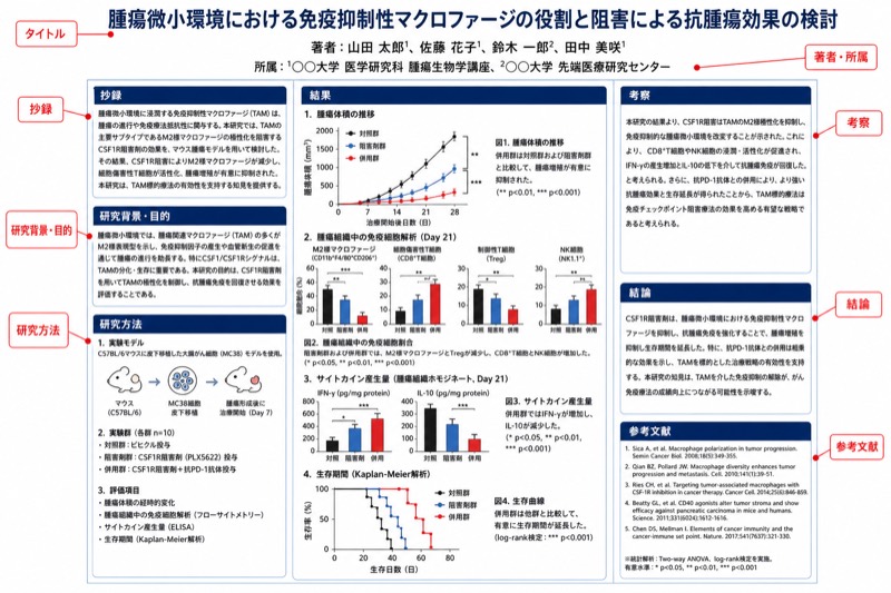
A multi-panel figure should not be a storage container for every result in a project. Each panel should answer a clear question or provide evidence needed to interpret the next panel. A common structure is overview, method or validation, primary result, and interpretation, but the correct order depends on the study. Start by writing one sentence for the figure’s scientific claim, then assign each panel a specific role in supporting that claim.
Visual consistency makes comparison faster. Use the same axis units, symbol meanings, color mapping, and statistical notation across related panels. Align plot areas where comparisons are intended, but do not force unrelated panels into an artificial grid. Leave enough space around axes and annotations to prevent collisions. If a legend is repeated in every panel, consider whether one shared legend would reduce clutter; if panels are likely to be read independently, a local legend may be safer.
- Give every panel a meaningful job rather than labeling panels only by the order in which data were generated.
- Use panel letters that are easy to locate and do not cover plotted data.
- Align comparable axes and preserve units consistently.
- Show sample size, uncertainty, and statistical annotations in a way the reader can identify without guessing.
- Remove decorative effects that do not communicate data or experimental structure.
Write a Caption That Explains the Figure Without Repeating the Results
A strong figure caption is a compact guide to reading the figure. It should identify what is shown, define the experimental or computational context, explain symbols and abbreviations, state what error bars or shaded regions represent, and provide enough information for a reader to understand the visual evidence without searching through several pages of the main text. The caption should not merely say “results are shown” or repeat a conclusion without explaining how the plotted elements support it.
A practical drafting method is to write the caption in layers. Begin with a short title-like statement describing the central subject. Next, explain panels in order, including the population, treatment, time point, model, or data source when those details are necessary. Finish by defining statistical markers, sample sizes, uncertainty measures, scale bars, and abbreviations. Follow the target journal’s rules for caption length, statistical reporting, and whether methods details may appear in the caption; those rules must be checked in the official author guidelines.
- Define every abbreviation that is not universally understood by the intended readership.
- State what error bars, confidence bands, or shaded areas represent.
- Clarify whether points represent independent samples, technical repeats, or aggregated observations.
- Explain scale bars with units and identify image treatments when relevant.
- Make sure the caption matches the final figure after every revision.
Why Figures Are Often Sent Back During Peer Review
Reviewers frequently request a figure redesign because the scientific message is difficult to verify visually. Typical problems include overcrowded panels, missing units, inconsistent scales, legends that require repeated searching, statistical annotations that are not defined, and colors that cannot be distinguished in print or by readers with color-vision differences. These issues are not merely cosmetic. If a reviewer cannot tell which groups were compared, what the error bars mean, or which image corresponds to which condition, the figure weakens confidence in the analysis.
Another common reason is mismatch between the figure and the manuscript. A caption may describe a sample size that does not match the plotted data, a panel letter may be wrong after rearrangement, or a revised analysis may leave an outdated axis label in place. Production teams may also request changes when text is not editable, files are flattened, fonts are missing, lines are too thin, or the figure depends on effects that do not survive export. Designing at final width and maintaining a controlled source file prevents many of these failures.
- Check every panel letter against the caption and the manuscript text.
- Verify units, decimal precision, axis limits, and group names after the final statistical update.
- Confirm that symbols, colors, line styles, and abbreviations have one meaning throughout the figure.
- Inspect the exported submission file, not only the editable source.
- Ask a colleague outside the project to describe the figure’s message in one sentence.
A Practical Workflow for Students, Researchers, and Instructors
An efficient workflow separates scientific planning from visual polishing. First, decide the claim and the target width. Second, assemble only the data and annotations needed to support that claim. Third, construct the figure using editable vector elements where appropriate. Fourth, write the caption before final styling; the caption often reveals missing definitions or unnecessary visual details. Fifth, export a test version at the intended size and review it both on screen and on paper if print publication is possible.
For classroom assignments and lecture slides, it is tempting to enlarge every label and add more colors because the figure will be projected. That is useful for teaching, but it is not the same as a journal figure. Maintain a publication-sized master and create a separate presentation adaptation when necessary. A slide version may use larger labels and fewer panels, while the manuscript version should follow the target journal’s width, format, typography, and caption rules. Never assume that a visually effective slide automatically meets submission requirements.
- Create a folder containing raw data, editable source artwork, linked images, fonts if required, exported files, and the final caption.
- Use stable filenames such as figure number, version, and date.
- Record the target journal and the date on which its guidelines were checked.
- Export only after hiding construction guides, unused layers, comments, and accidental marks.
- Have one person check scientific accuracy and another check readability and production quality.
How to Make Figures for Nature and Science Journals: Final Submission Checklist
Before submission, compare the figure against the official author guidelines line by line. Confirm the required dimensions, accepted file formats, color mode, resolution rules for raster content, font handling, naming conventions, and whether figures must be uploaded separately from the manuscript. Specific journal requirements can change, and some article types may have different limits or production instructions, so any number or format mentioned in a general guide should be treated as a starting point only.
The final review should simulate the reader’s experience rather than the designer’s experience. View the figure at its intended physical size, read the smallest important text, follow the panel sequence, and verify that the caption defines every essential visual element. If the message depends on a legend, axis, or color distinction that is easy to miss, redesign the figure instead of hoping the reader will spend extra time decoding it. A figure is successful when its visual structure makes the evidence easier to inspect, not when it contains the maximum amount of information.
- Is the figure designed for the correct single-column, double-column, or full-page width?
- Does all essential text remain readable at final size?
- Are vector elements and text editable where required?
- Are file format, resolution, color, and font choices compliant with the official guidelines?
- Do the caption, panel labels, statistics, units, and manuscript references agree?
- Can a reader identify the main conclusion without being told where to look?
この図についてのFAQ
What size should a figure be for Nature or Science?
Nature figures are typically designed at approximately 89 mm for a single column and 183 mm for two columns. Science figures are approximately 55 mm for a single column, 121 mm for two columns, and 183 mm for a full page. These are reference magnitudes only; check the official author guidelines for the exact journal and article type before submission.
What is the minimum font size for a Nature or Science figure?
There is no single universal minimum that applies to every figure and article type. Use the minimum stated in the target journal’s official author guidelines, then export the figure at final size and check whether the smallest essential text is readable without zooming. If a label is technically allowed but difficult to read, simplify the figure instead of relying on readers to enlarge it.
Should scientific figures be submitted as PDF, SVG, TIFF, or another format?
The acceptable format depends on the journal, article type, and whether the content is vector artwork, photography, or another raster-based image. Top journals generally require vector formats and editable text for constructed artwork, while raster content may have separate resolution rules. Always use the official author guidelines as the final authority and keep an editable source file.
Why did reviewers ask me to redo my figure?
Reviewers often request changes when the figure is crowded, labels or units are missing, color coding is ambiguous, statistical annotations are undefined, or the caption does not explain the visual evidence. Production editors may also require revisions when text is not editable, files are flattened, fonts are missing, or the exported artwork does not survive resizing. These requests usually indicate a communication or production problem, not necessarily a problem with the underlying experiment.