How to Make a Schematic Diagram: A Practical Guide
If you are learning how to make a schematic diagram, begin by separating a system's meaning from its physical appearance. A schematic uses symbols and simplified shapes to express the components of a system and their relationships, deliberately omitting realistic appearance and scale. In contrast, a realistic illustration depicts what an object looks like, while an engineering drawing includes precise dimensions. The purpose of a schematic is therefore not to reproduce reality but to make structure, flow, function, or causality easier to understand.
This distinction matters whether you are a graduate student preparing a paper, a student completing an assignment, or a teacher designing lecture slides. A good schematic helps the reader answer a focused question: What is connected to what? What happens first? Which component controls another? Where does a sample, signal, force, or biological process move? This guide presents a practical workflow for circuit schematics, experimental setups, system block diagrams, and medical or biological schematics, with concrete advice on abstraction, symbols, legends, layout, labels, common errors, and final checks.
1. How to Make a Schematic Diagram by Defining the Message
Before opening a drawing tool, write one sentence describing what the reader should learn from the figure. For example: “The diagram shows how the sample moves through preparation, imaging, and analysis,” or “The schematic explains how the feedback controller changes the actuator in response to the sensor.” If you cannot state the purpose in one sentence, the diagram is probably trying to communicate too many ideas at once.
Next, convert that sentence into a relationship list rather than a list of objects. Instead of writing “laser, mirror, lens, sample, detector,” write “laser illuminates sample,” “mirrors redirect the beam,” “lens focuses the beam,” and “detector records the output.” Verbs reveal the connections that must be visible. They also help you choose meaningful arrows, line styles, and labels.
Define the intended reader and viewing context as well. A paper figure may need to stand alone when separated from the main text, whereas a lecture-slide schematic can be introduced gradually through narration. A classroom assignment may need to demonstrate that you know accepted symbols. Record these constraints before drawing so that later design decisions support the actual communication task.
- Write one sentence stating the figure's main message.
- List the essential components, then describe their relationships with verbs.
- Identify the reader's expected background knowledge.
- Decide whether the figure explains structure, sequence, flow, control, or cause and effect.
- Remove any object that does not help communicate the stated message.
2. Choose the Right Level of Abstraction
Abstraction determines how much reality to retain. At a high level, an entire instrument may appear as one labeled block. At a middle level, that instrument may be divided into source, processing, control, and output modules. At a low level, the figure may show individual optical elements, valves, electronic components, or anatomical structures. The correct level is the least detailed level that still allows the reader to understand the relationship you are explaining.
Use consistent abstraction within each visual layer. A system diagram looks incoherent if one module is represented by a plain rectangle while an equally important module is rendered as a detailed three-dimensional object. If detail is necessary in only one area, use a clearly framed inset or callout. This lets the overview remain simple while the inset explains a critical mechanism.
A useful test is to hide every label temporarily. The shapes and connections should still reveal the broad organization, even if the reader cannot identify every component. Then restore the labels and ask whether each added detail changes the interpretation. Decorative screws, realistic textures, shadows, and minor anatomical features usually do not belong unless they carry scientific meaning.
- Overview level: major stages or subsystems only.
- Intermediate level: functional modules and important interfaces.
- Detailed level: individual components required to explain operation.
- Use an inset when one region needs more detail than the rest.
- Do not combine symbolic, realistic, and engineering-detail views without a clear reason.
3. Build a Consistent Symbol and Legend System
Symbols form the visual vocabulary of a schematic. Use established disciplinary symbols when your audience is likely to know them, especially for electrical components and other standardized technical elements. For concepts without a standard symbol, create simple geometric forms and apply them consistently. A reader should never have to guess whether two different shapes represent different categories or merely reflect inconsistent styling.
Every symbol must be defined in the legend. This includes uncommon shapes, abbreviations, colors, line styles, arrow types, and coded markers. A legend is especially important when solid and dashed lines have different meanings, when colors identify sample groups, or when multiple arrowheads represent flow, regulation, inhibition, or measurement.
Do not use color as the only carrier of meaning. Pair it with a shape, pattern, line style, or direct label so that the diagram remains understandable when printed in grayscale or viewed by readers with color-vision differences. Keep the palette limited and functional: assign each color a stable meaning rather than choosing colors independently for every object.
- Give one meaning to each symbol and use it consistently.
- Define every symbol in the legend, including custom symbols.
- Explain solid, dashed, dotted, and double lines if more than one style appears.
- Use distinguishable shapes or labels in addition to color.
- Check whether abbreviations are defined in either the figure or its caption.
4. Arrange the Layout Around Flow and Hierarchy
Good schematics generally direct information flow from left to right or from top to bottom, align elements of the same type, minimize crossing connectors, define every symbol in the legend, and keep labels consistent with the terminology used in the main text. Choose one dominant direction and preserve it. Reverse arrows and feedback paths are acceptable, but they should appear as deliberate exceptions rather than making the entire route ambiguous.
Start with a rough grid. Place components that perform similar roles on the same row or column, and give repeated objects equal dimensions. Keep spacing consistent: objects that belong together should be closer than objects belonging to different stages. White space is structural information because it separates modules, clarifies hierarchy, and provides room for readable labels.
Reduce crossings by changing the order of nodes, moving related components into groups, or routing secondary connections around the outside of the main flow. Avoid diagonal connectors unless they materially improve clarity. When a line must turn, use a small number of deliberate bends. If several lines share a destination, consider a bus, junction, or grouped connection, but define its meaning clearly.
- Use left-to-right flow for processes, timelines, and many signal chains.
- Use top-to-bottom flow for hierarchies, pipelines, and layered systems.
- Align centers or edges rather than positioning elements by eye.
- Keep repeated components equal in size and spacing.
- Move nodes before accepting a crossed connector.
- Separate the main path visually from feedback or secondary paths.
5. Write Labels That Work Without Guesswork
Labels should identify components and clarify relationships without turning the figure into a page of prose. Use short noun phrases for objects and concise verbs for actions. “Filtered sample” is usually more useful than “sample,” while “signal processing module” is clearer than “box 2.” Put labels close to the elements they describe, and use leader lines only when direct placement would cause confusion.
The wording of labels must match the terminology in the main text. If the manuscript calls a component the “reference electrode,” the figure should not alternate between “reference,” “control electrode,” and an unexplained abbreviation. Match capitalization and notation consistently as well. Define abbreviations at first use according to the conventions and requirements that apply to the document.
Make visual hierarchy explicit. Primary stage names should be more prominent than component labels, and component labels should be more prominent than optional notes. Use bold weight or restrained size differences instead of many unrelated font styles. Mathematical symbols, gene names, chemical notation, units, and subscripts should follow the conventions of the relevant field; where a publication or institution specifies formatting, use the official guide.
- Use the same technical term in the schematic, caption, and body text.
- Prefer direct labels over a distant numbered key when space allows.
- Keep labels horizontal unless the geometry makes that impractical.
- Place units next to measured quantities, not in an unrelated part of the figure.
- Check capitalization, italics, subscripts, superscripts, and abbreviations.
- Avoid relying on tiny notes to explain an unclear connection.
6. Adapt the Method to Different Schematic Types
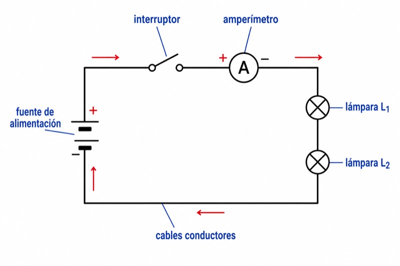
For a circuit schematic, connectivity and component identity are more important than physical placement. Use accepted electrical symbols where applicable, make junctions unambiguous, and distinguish connected intersections from lines that merely cross. Group functional regions such as input, amplification, control, power, and output. If component values or pin identifiers are relevant to the explanation, place them consistently and verify them against the source information.
For an experimental setup, focus on the path of the sample, beam, fluid, force, or signal. Arrange equipment in operational order rather than attempting a realistic view of the laboratory bench. Indicate critical interfaces such as tubing connections, optical paths, environmental chambers, measurement points, and data-acquisition links. If physical orientation affects the experiment, include a direction marker or a small orientation cue instead of rendering every object realistically.
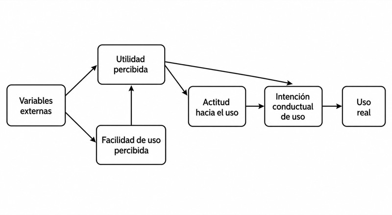
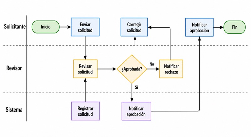
A system block diagram should emphasize function, interfaces, and information exchange. Use blocks with parallel grammatical labels, such as all nouns for modules and all verbs for processes. In a medical or biological schematic, distinguish anatomical structures, cells, molecules, interventions, and outcomes through a controlled symbol system. Simplify anatomy deliberately, but retain landmarks required to understand location, direction, or mechanism; include orientation and scale information only when they are scientifically relevant.
- Circuit: prioritize electrical connectivity, junction clarity, and recognized symbols.
- Experimental setup: show operational order and the path of material, energy, or data.
- System block diagram: emphasize modules, inputs, outputs, and control relationships.
- Medical schematic: preserve clinically or anatomically meaningful orientation.
- Biological schematic: distinguish entities, interactions, locations, and process stages.
- Use separate panels when one diagram cannot show both overview and mechanism clearly.
7. How to Make a Schematic Diagram in a Reliable Workflow
A dependable workflow begins with content, not styling. First, write the message and relationship list. Second, sketch several thumbnail layouts using simple boxes and arrows. Third, choose the layout with the clearest dominant flow and fewest crossings. Fourth, replace temporary boxes with final symbols. Only after the structure works should you refine line weights, typography, colors, and spacing.
Create reusable rules before polishing. Decide on one font family, a small set of text levels, a standard box style, consistent arrowheads, and defined line meanings. Work with alignment and distribution controls available in vector drawing, presentation, diagramming, or scientific illustration tools rather than positioning everything manually. Keep editable source files so that terminology, colors, and dimensions can be revised later.
Test the result at its expected display size. A schematic that looks clear while highly enlarged may become unreadable in a paper column, worksheet, or lecture slide. Export a draft, place it into the actual document, and inspect labels, lines, symbols, and color contrast there. Submission schematics commonly require a vector format or a raster image above 300 DPI; the exact requirement depends on the journal, so use the official journal guide.
- Draft relationships before drawing finished shapes.
- Create two or three thumbnail layouts instead of polishing the first idea.
- Resolve crossings and hierarchy before choosing colors.
- Apply symbols, typography, lines, and spacing systematically.
- Test the figure inside the paper, assignment, or slide where it will appear.
- Keep the editable source and make the final export from that source.
8. Common Mistakes and a Final Self-Check
One common error is drawing the object's appearance instead of the relationship being explained. Another is including every known component, which turns a focused schematic into an inventory. Inconsistent symbols, unexplained abbreviations, weak visual hierarchy, and excessive color also increase cognitive load. If readers need a long verbal explanation just to find the starting point, the layout needs revision.
Ambiguous connectors are particularly damaging. Check the direction of every arrow, every junction, and every endpoint. A line that stops near a box may look connected even when it is not, while an arrow passing behind a label can lose its meaning. Ask a colleague or student to describe the diagram without first reading your explanation. Their interpretation will reveal assumptions that may be invisible to the person who created it.
Complete separate content and production checks. The content review asks whether the science, terminology, and relationships are correct. The production review checks legibility, consistency, file format, and export quality. For submitted work, confirm dimensions, fonts, color mode, file type, and resolution using the official journal, course, conference, or institutional guide.
- Can a reader identify the starting point within a few seconds?
- Does every component support the figure's stated message?
- Is the primary flow left to right or top to bottom?
- Are similar elements aligned and styled consistently?
- Have unnecessary connector crossings been removed?
- Does every arrow have a clear source, destination, and meaning?
- Is every symbol defined in the legend?
- Do labels match the terminology in the main text?
- Are labels and lines readable at the final display size?
- Does the exported file follow the applicable official guide?
Preguntas sobre este diagrama
How do I make a schematic diagram for a research paper?
Begin with one sentence stating what the figure must explain, then list the essential components and relationships. Build a simple left-to-right or top-to-bottom layout, define all symbols, and test the figure at its intended publication size. Use a vector format or a raster image above 300 DPI when required, and follow the official journal guide for exact submission specifications.
What is the difference between a schematic diagram and an engineering drawing?
A schematic uses symbols and simplified shapes to communicate system components and relationships while deliberately omitting realistic appearance and scale. An engineering drawing includes precise dimensions and supports construction, manufacturing, or technical specification. A realistic illustration, by contrast, primarily shows what an object looks like.
How can I make my schematic diagram look less cluttered?
Remove elements that do not support the main message, group related components, and use a clear dominant flow. Align similar objects, shorten labels, move nodes to reduce connector crossings, and place secondary details in an inset or separate panel. Do not try to solve structural clutter by simply shrinking the text.
Should a schematic diagram be drawn to scale?
Usually, a schematic deliberately omits realistic scale because its purpose is to clarify relationships rather than reproduce physical dimensions. Show scale or relative size only when it affects the scientific interpretation. If accurate dimensions are required, the result may need engineering-drawing elements or another appropriately specified figure type.